CXUI Component Library

This library’s 56 accessible and feature-rich UI components are the building blocks for Cisco’s CX Cloud and PX Cloud. It empowers 150+ engineers across 12+ teams.
As a Senior UX Engineer, I partner with the design system team to vet each component for accessibility and maintainability, before building them using Angular. Once released, I act as a developer advocate to encourage and support the adoption of these components.
I have contributed 15+ components to the library; below are a few examples.
File Upload
The File Upload component allows users to upload files by drag-and-drop or through the “browse files” button, which triggers the system’s file explorer. It has built-in file type, size, duplicate, and file count validations. It also allows for custom error messaging to provide more clarity to the user. Depending on the file’s upload state, the file upload can be canceled, deleted, or dismissed.


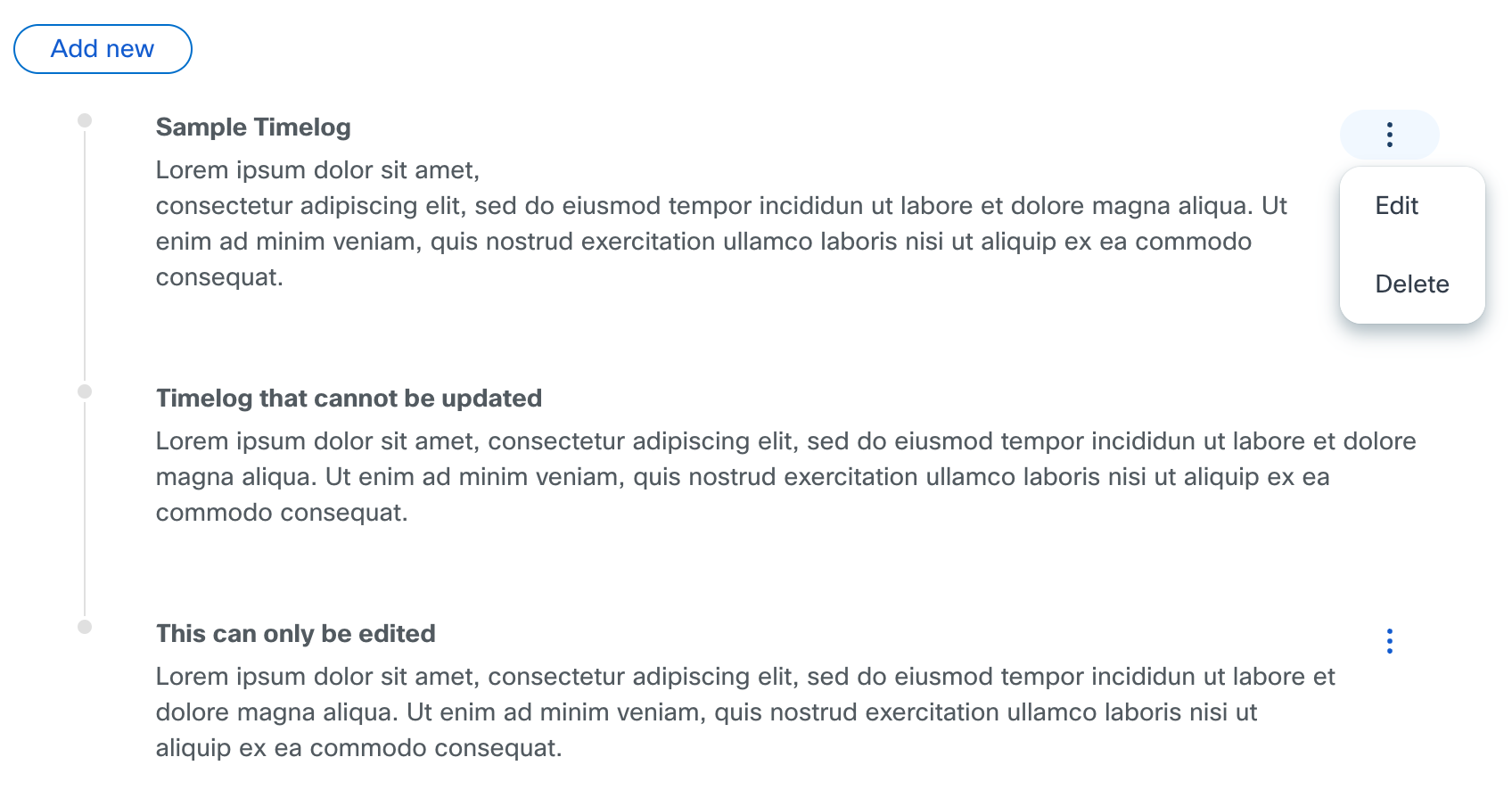
Timelog
The Timelog component presents information clearly and chronologically. Users can easily add, edit, and delete items. Developers could also define input validation rules. Despite having multiple parts, all elements are encapsulated within the Timelog component, simplifying the process of adding them to pages. This component is utilized for displaying order statuses, activity histories, and comments on support cases.
Locked
“Locked” is an engineered state that prevents users from doing a typical action, i.e. clicking a button to go to a new page. Instead, users get a tooltip explaining why they cannot perform that action. This allows one platform to serve several user types with different access levels. It can also encourage upsells by showing all available capabilities, but blocking the action until the user purchases the matching service level.
